
Videography Studio | Ai
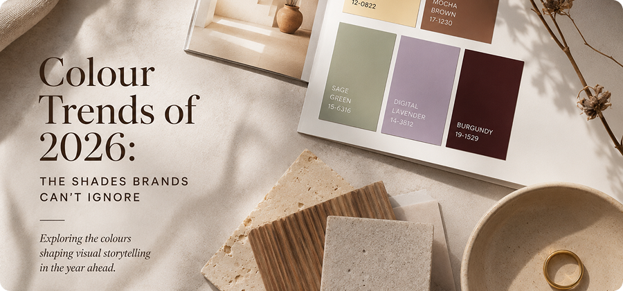
Colours do a lot more than just fill a space. They make us feel things they help us figure out who we are and they influence how we connect with brands. This year colour trends are not just about making a statement or looking pretty. They are about making people feel comfortable, happy and like they can trust the brand.
For brands choosing the colours is not just about how things look it is about telling a story. Whether you are making a commercial taking pictures for media or creating a whole brand image the colours you pick can tell people what your brand is like and what it stands for.
Butter Yellow: This colour is happy and calm.
Butter Yellow is a colour that people are going to love this year. It is warm it makes you feel good. It is easy to like. It is not like yellow colours that are really bright and loud. This one is softer. It makes you feel calm and happy.
It looks really good with beige, brown and natural textures. This makes it perfect for brands that sell lifestyle products, skincare, jewellery and fashion. Butter Yellow adds warmth to pictures without taking over the story.
Mocha Brown: This colour is warm and elegant.
Earth colours are still really popular. Mocha Brown is one of the best. It is rich and easy to like. It makes people think of comfort, quality, and timelessness.
Brands use Mocha Brown a lot in backgrounds, props, packaging and styling because it is so versatile. It looks good with colours, cream, and natural textures, and it makes pictures look luxurious but still down to earth.
For making commercials Mocha Brown is a choice because it adds depth and elegance without being too dramatic.
Light: The Beauty of Authenticity
Natural light feels honest, organic and beautiful. It creates transitions between highlights and shadows showing real colors and textures. This makes it popular for lifestyle campaigns, food, beauty, and everyday luxury products.
People today are really influenced by what they want to be. They do not just ask what a product can do they ask:
Shadows: The Silent Storytellers
Shadows play a role in shaping mood and perception. They add mystery, depth, and sophistication to an image. A subtle shadow can create elegance. Dramatic shadows can evoke luxury and intrigue.
In premium brand photography shadows are design elements that contribute to the story.
Digital Lavender: This colour is new and exciting.
Soft purple colours are changing the way things look. Digital Lavender is a great example. It feels like the future. It is also calming. This makes it a great choice for brands that want to look innovative and friendly.
It looks really good in beauty commercials, wellness brands, lifestyle photography and minimalist product pictures. When you pair it with white or metallic colours it makes pictures look fresh and modern.
Sage Green: This colour is natural and elegant.
People are looking for brands that’re real and honest and nature-inspired colours are still popular. Sage Green is an example. It is subtle, refreshing and it works well with lots of things.
It helps products stand out. It makes people feel calm and balanced. Whether you use it in backgrounds, styling or brand images Sage Green adds elegance without being too much.
For brands that want to talk about sustainability, simplicity or wellness Sage Green is a choice.
Burgundy: This colour is bold and elegant.
Burgundy is a colour that makes a statement this year. It is deep and rich. It looks really good. It adds drama and character. It is still refined.
It looks really good with gold, textured fabrics, and soft lighting. This makes it perfect for premium product pictures, jewellery commercials, and luxury brands.
It does not look loud or flashy. It just looks confident and timeless.
Beyond Trends: Telling Stories That Mean Something
While colour trends change every year the important thing is to create pictures that tell a story and mean something to the brand. The right colours do not just make things look pretty. They make people feel things they help people remember the brand and they create an image that lasts.
This year the focus is on using colours in a way that feels real and honest. Whether it is the warmth of Mocha Brown, the happiness of Butter Yellow or the calmness of Sage Green, the colours are the ones that feel true, to the story.
Because when we look at pictures colour is not something we see. It is something we feel.
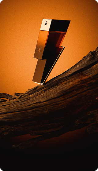
Elevate Your Brand Through Creative Photography
Professional studio photography for products, brands, moments.


